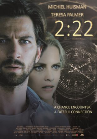
“A picture is worth a thousand words”, which also is the case with movie posters. When this movie was playing in the cinemas over here I regularly saw the one made for this movie and it’s a bad one. It’s a poster which really doesn’t seel the movie. Firstly the design looks like something made by a fan who cut out the heads of the main characters and after that didn’t spend a lot of time thinking about a font and applying inner and outer shadows in Photoshop. It’s also a very dark poster, which isn’t pleasing to the eyes. The clock shows the same time as the title of the film, but what that means isn’t clear. Basically a poster which doesn’t make you want to see the film, which at least looks a lot better than its promotional material. Continue reading
