My journey into stories behind famous movie related things we take for granted continues, still focussing on the logos of the big movie companies. This week’s choice: The Universal Pictures logo.
Universal was founded by Carl Laemmle. He moved to the US in 1884 and had a job as a manager. He was fascinated by the nickelodeons and saw how many people visited them and decided to start purchasing them. In 1909 he founded the Independent Moving Pictures Company (IMP). In 1912 a contract was signed with other studios (Powers Picture Company, Champion Films and American Éclai) and this resulted in the founding of the Universal Motion Picture Manufacturing Company in 1914 with Laemmle as its president. Through the years the company has had various logos:
1914-1919
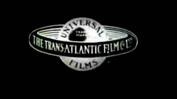
The first logo that was used already showed a globe which has a lot of resemblance to Saturn with its ring.
1920-1922
The ring is now slightly tilted and various fonts are used.
1923-1926
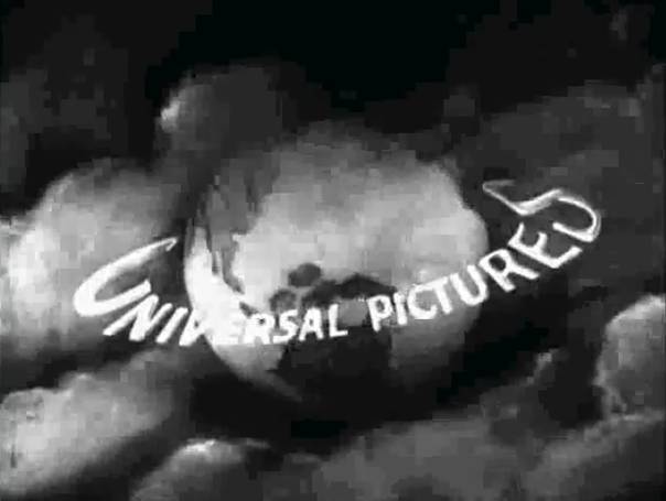
This is the first one where the planet looks like earth. This one shows a plane flying around the world leaving a trail of smoke which slowly turn into the words “Universal Pictures”.
1927-1936
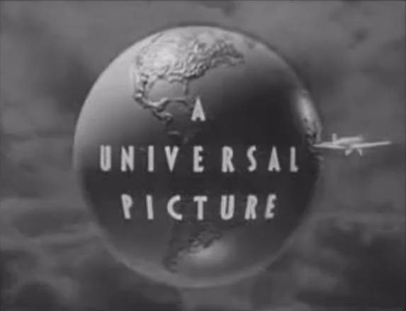
An updated version of the previous logo which also has the plane flying around the globe. The text now reads “A Universal Picture”.
1936-1946
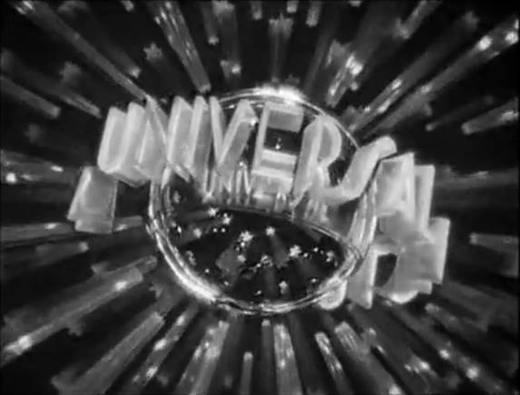
Now this is my personal favorite as it shows the globe made from plexiglass with the words A Universal Picture circling around it surrounded by sparkling stars. It was built by Alexander Golitzen and photographed by John Fulton.
1946-1963
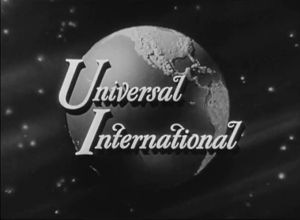
As the company merged with International Pictures Company a new logo was commisioned. This version simply showed a rotating globe with the words “Universal International” shown on top of it.
1963-1990
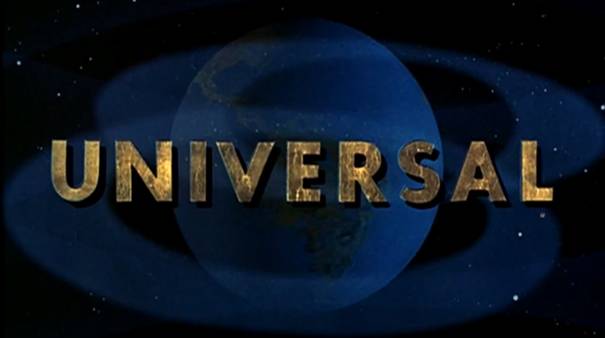
The camera zooms through space towards a rotating earth where the word “Universal” fades in.
1990-1997
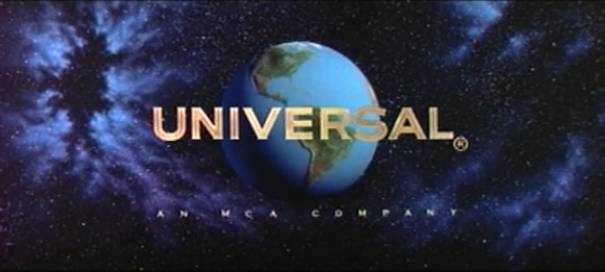
This one starts on the side of the earth with a short reflection of the sun on the water after which the Universal letters come around as the camera slowly zooms out to show the earth and the stars behind it. It’s interesting to note that this wasn’t done with CGI, but was all model work.
1997-2012
[youtube=http://www.youtube.com/watch?v=KpNkgRv_8XE]
The first CGI version of the logo where light emerges from the globe, slowly revealing the continents. The name Universal appears in gold and white lettering.
2012-

The brand new logo to celebrate the 100th Anniversary. It will be shown first with the animated movie The Lorax. Universal has also set up this website to celebrate, which includes a very deep look into its history and its movies.


Wow, they’ve come a long way haven’t they? This isn’t one of my fave studio logos but still it’s cool to learn more about it. Thanks Nostra.
They have! Since I’ve started the series I do notice these logos more than I did before 🙂
Wow the new one looks great! Going to have a look at that website now! Another great post, keep up the good work!
Thanks Pete
I do love this series… here is hoping for a bit of hitlist loving for you
Thanks a lot Scott, it’s fun doing them!
Universal seems to have been the only studio who hasn’t gone all weird and trippy during the 60s/70s. They kept it classic.
Their new 2012 logo looks very… shiny. I kinda really love the 1946 era of the logo. Very classic. Love the typeface.
Yeah, it is something I noticed as well!
I like the new logo although I can’t wait to see what it looks like in motion….
Ooo, forgot to think about the movement of it all. Should be good!
I’m a big fan of their new logo for the 100th anniversary. I also really like the 1927-1936 logo. I’m not sure I’ve seen too many films with it, but its cool nevertheless.
Thanks for the comment Max!
The logo or the introduction of Universal Pictures, 1997 remains the same because there are rumors that arrived or spread the new intro of Universal Pictures for the 100 years it was assumed that Universal opens new logo and it was a rumor.
I didn’t know that, although I’d love to see it moving!
I can’t wait to see the new Universal Logo! I hope it’ll show up on YouTube this or next weekend.
Looking at the previous comment I’m now not sure if there will be one!
Well, new logo will be revealed on March 2nd for the premiere of “Dr. Seuss’ The Lorax”. And I’m not sure if it will be on YouTube when that ever happens, if they did it with the Paramount 100th Anniversary logo, why can’t Universal itself?
Well, let’s hope it will be…only a couple of days till we will find out!
http://www.youtube.com/watch?v=pr7QCUv_MUQ&feature=youtu.be
Thanks for that Adam! It’s looks epic!
Pingback: Universal Pictures and Focus Features celebrate anniversaries in 2012 « The Hollywood 15 Headlines
The one that’s say 1937-1946 is used in a lot of woody woodpecker cartoons
Interesting!
I liked a number of movie logo transitions into the movie itself, and I pay particular attention to this..
The opening scene in …1] Waterworld; 2] The Burbs; 3] Knowing
I love what you guys are usually up too. This kind of clever work and exposure!
Keep up the fantastic works guys I’ve included you guys to my own blogroll.
In the late 50s-early 60s, the ‘planet appearing out of nowhere’ version showed the name of Universal’s top executive, Edward Muhl, down in the lower left-hand corner. His name came into focus along with the main Universal lettering. Muhl had been at Universal for decades. Besides Jack Warner, he’s the only only one I know who got the honor of regular recognition on a studio logo.
My favorite Universal-International logo treatment: ‘Spartacus’, with Alex North’s scoring.
Like Cedric Gibbons at MGM (who designed the Oscar™ statuette), Alexander Golitzen was Universal’s premier art director. John Fulton helped invent process (‘rear projection’) special effect photography, and later settled in at Paramount.
The fanfare in the 30s-40s was pretty dandy. Not sure who wrote it. The ‘triumphal’ fanfare of today (by John Williams?) is outstanding.
Did not know that about Muhl’s name appearing. Thanks for the info!
It’s on the Universal logo for “Charade”. That’s the only movie I’ve seen Edward Muhl’s name on.
My favorite, without doubt, is the 1936-46 art deco chrome globe with the rotating crystal stars! Wouldn’t it be wonderful if this (I heard they used a rotoscope to film it) had been filmed in color, with “A UNIVERSAL PICTURE” in yellow neon with orange shadow reflecting on the chrome ball. The triumphant Universal fanfare used here is second only to my favorite, the Fox fanfare (with the CinemaScope addition).
Yeah, that one is my favourite and it really looks stunning. Wish they’d go back to an updated version of that!
@Jimbo…go watch this clip, then rent or see 1973’s The Sting. Universal did have a color version which was used in a couple of films in the 1940’s.http://www.youtube.com/watch?v=_xWS3h-apmk
Yes, thanks. But I had seen this, and thought it was a rather shoddy colorized version of the original logo, much less impressive than if they had taken the trouble to reshoot it in color. The letters would really stand out if they were in neon on the dark blue background and the mirrored “earth”.
I don’t think it was rotoscoped. There seems to be dust particles that follow the flow of the text.
I wish someone would rebuild this model today and explain the mechanics. Does anyone know The Mythbusters personally????
i like universal
The 1990-97 Universal logo theme was composed by James Horner. Jerry Goldsmith composed the theme used from 1997 to today. It was re-orchestrated for the 2012 hundredth anniversary logo.
I can imagine how the rotating globe and text for the 1936-1946 logo could have been done. How they made the star projections spin in place around them at the same time is more difficult to imagine, unless they were added in using matte photography.
What’s the typeface or font used for the 1963-1990 logo? It’s very iconic and should be used in the future.
Best
Just stumbled on this website. I believe the 1936-46 logo may have been built by Alexander Golitzen but am pretty sure it was designed by then head of Universal Art Department John Harkrider.
Hitchcock’s thriller “The Birds”, which was released by Universal in 1963, has a logo that I’ve only seen on that one film. It’s a static, monochromatic shot of earth, with the words “A Universal Release” superimposed over it.
Does ANYONE know how the 1936-46 reflective globe logo was built and filmed? I have been looking at it for 40+ years and still can not figure it out. Any help out there?
Thank you!
How did Universal know what the Earth looked like when the first space flight wasn’t until 1961?
Cartography? https://en.wikipedia.org/wiki/Early_world_maps
Yes.
The Romans had a pretty good idea of what the Mediterranean Sea (which they referred to as “Mare Nostrum” or “our sea”) from charts created by sailing along the coast.
Hi.
I assume that they knew simply because cartographers knew from surveying and explorations what the coastlines looked like. The spaceflights simply confirmed what maps since the 19th-century indicated.
GaDS
In the 19, Universal-International resumed their series of Arabian Nights films, many starring Tony Curtis. The studio also had a success with monster and science fiction films produced by William Alland, with many directed by Jack Arnold. Other successes were the melodramas directed by Douglas Sirk and produced by Ross Hunter, although for film critics they were not so well thought of on first release as they have since become. Among Universal-International’s stable of stars were Rock Hudson, Tony Curtis, Jeff Chandler, Audie Murphy, and John Gavin . Although Decca would continue to keep picture budgets lean, it was favored by changing circumstances in the film business, as other studios let their contract actors go in the wake of the 1948
This is by far my favorite studio identifier of them all. As a kid I was hypnotized by the sight of this crystal globe and the vibrating glass stars that surrounded it. Recently I was reunited with this childhood “vision” when I started watching on You Tube the Sherlock Holmes series starring Basil Rathbone and Nigel Bruce that was made by Universal in the early 1940’s.
Does anyone know what happened to to 1927- 36 Flying Airplane and Globe in the Intro.
Yes, thanks. But I had seen this, and thought it was a rather shoddy colorized version of the original logo, much less impressive than if they had taken the trouble to reshoot it in color. The letters would really stand out if they were in neon on the dark blue background and the mirrored “earth”.